 by
by Introduction
When we talk about workplace safety, we often focus on PPE, machine guarding, or training. But there’s another powerful safety tool that we encounter every single day — colour.
Colours are not just for decoration; they communicate, warn, and protect. Whether it’s a bright red fire extinguisher, a yellow caution sign, or a green first-aid box, every colour carries a specific message designed to keep workers safe.
In this article, we’ll explore the fascinating world of Colour Code and Safety, covering topics like Indian Standards for colour codes, colours used to identify hazards, accident prevention signs, and even the psychological effects of colours.
So, let’s dive in — because safety is not just about rules, it’s also about perception.
🔍 Why Colour Coding Matters in Safety
Colour is one of the most effective non-verbal communication tools. It works faster than words. A person can recognize colour cues instantly, even from a distance, which is critical during emergencies.
Imagine a workplace where all pipes, signs, and warnings are in the same neutral tone — chaos, right? The purpose of a colour code is to create visual order and reduce response time when something goes wrong.
By using consistent colours for specific hazards, industries help workers instantly recognize what’s safe, what’s dangerous, and what action to take.
🇮🇳 Indian Standards for Colour Codes
In India, the Bureau of Indian Standards (BIS) provides specific guidance for safety colours through the following standards:
- IS 2379: 1990 – Colour code for identification of pipelines.
- IS 1234: 1997 – Safety colours and safety signs.
- IS 5: 2007 – Colours for ready mixed paints.
These standards are aligned with international practices (like ISO 3864 and ANSI Z535), ensuring consistency and universal understanding.
Let’s break them down.
🔹 IS 2379: Colour Code for Pipelines
This standard specifies how pipes should be colour-coded to identify the material they carry — whether it’s air, water, acid, gas, or steam. This is crucial in preventing mix-ups that can cause severe accidents.
| Service | Ground Colour | Identification Colour | Example |
|---|---|---|---|
| Water | Green | White | Cooling water, potable water |
| Steam | Silver Grey | Black | Steam pipelines |
| Air | Sky Blue | Black | Compressed air lines |
| Acids and Alkalis | Violet | Yellow | Acid transfer pipes |
| Gases | Yellow Ochre | Black | Fuel gas, oxygen |
| Oils | Brown | White | Lubricating or hydraulic oil |
| Fire Fighting Lines | Red | — | Fire hydrant, sprinkler lines |
By following these colour codes, workers can instantly identify the contents of pipelines and take appropriate safety measures during maintenance or emergencies.
🔹 IS 1234: Safety Colours and Safety Signs
This standard provides guidance on using specific colours to communicate safety information and hazard warnings.
| Colour | Meaning / Purpose | Example of Use |
|---|---|---|
| Red | Danger, Stop, Fire equipment | Fire extinguisher, Stop button |
| Yellow / Amber | Caution, Attention | “Caution: Hot Surface” signs |
| Green | Safety, First aid, No danger | Emergency exits, first-aid boxes |
| Blue | Mandatory actions | “Wear helmet”, “Use goggles” signs |
These colours help create a universal language of safety, understandable even to those who may not speak the same language.
🚧 Colours to Identify Hazards
Every safety professional knows — colour saves lives. Let’s explore how different colours are used to identify hazards and guide safe behavior.
🔴 Red: The Colour of Danger and Fire
Red immediately attracts attention. It signifies danger, prohibition, and emergency equipment.
- Used on fire extinguishers, alarm buttons, and emergency stop switches.
- Also marks areas where smoking or open flames are prohibited.
- In road safety, red indicates STOP and prohibitory signs.
👉 Tip: Red is not used for informational signs because it’s too commanding — it must be reserved for critical warnings.
🟡 Yellow: The Colour of Caution
Yellow is the universal colour for warning and caution. It signals workers to slow down, stay alert, or be careful.
- Used for trip hazards, moving machinery, and slippery floors.
- Black and yellow stripes often mark hazardous edges or areas.
- Also used around electrical panels or high-voltage areas.
👉 Tip: Yellow combined with black stripes is one of the most recognizable warning patterns — never ignore it!
🟢 Green: The Colour of Safety and First Aid
Green is calming and universally associated with safety, health, and permission.
- Indicates first aid stations, emergency exits, and safe areas.
- Also used for “Safety Instructions” or locations of emergency equipment like eye wash stations.
👉 Tip: Green signs usually guide you toward safety or safe behavior.
🔵 Blue: The Colour of Mandatory Actions
Blue doesn’t warn — it instructs. It tells workers what must be done for safety.
- Used on signs that say “Wear Safety Shoes”, “Use Ear Protection”, or “Helmet Required”.
- Indicates a mandatory rule or action that is not optional.
👉 Tip: Blue means compliance — something you must do to stay safe.
⚫⚪ Black and White: The Colours of Information and Guidance
Black and white are neutral colours used for directional signs, housekeeping markings, or traffic guidance inside plants.
- Example: Zebra crossings, storage areas, or aisle markings.
- They guide orderly movement within workplaces without implying danger.
🪧 Accident Prevention Signs and Their Meanings
Accident prevention signs combine shape, colour, and symbols to communicate specific safety messages effectively.
According to IS 9457:1980 and IS 1234:1997, here’s how they are classified:
| Type of Sign | Shape | Background Colour | Meaning / Example |
|---|---|---|---|
| Prohibition Signs | Circular | White with red border | No smoking, No entry |
| Warning Signs | Triangular | Yellow with black border | High voltage, Toxic hazard |
| Mandatory Signs | Circular | Blue with white symbol | Wear helmet, Wear gloves |
| Safe Condition Signs | Rectangular / Square | Green with white symbol | First aid, Emergency exit |
| Fire Equipment Signs | Square / Rectangular | Red with white symbol | Fire extinguisher, Fire hose |
These symbols are standardized so that workers, regardless of literacy level or language, can instantly interpret the meaning.
🧠 Psychological Effects of Colour in Safety
Colours don’t just communicate — they influence how people feel and react. That’s why the psychological aspect of colour selection is vital in safety design.
Let’s understand how colours affect human behavior:
| Colour | Psychological Effect | Impact on Safety |
|---|---|---|
| Red | Stimulates adrenaline, increases alertness | Good for emergencies but can cause anxiety if overused |
| Yellow | Energizing, attention-grabbing | Keeps workers alert in hazardous zones |
| Green | Calming, reassuring | Reduces stress, ideal for safe areas |
| Blue | Promotes calm and trust | Encourages compliance with instructions |
| Orange | Warns of moderate risk | Often used for moving machinery or construction zones |
| White | Neutral, clean | Improves visibility, used for demarcation lines |
When used wisely, colours not only reduce accidents but also enhance productivity and morale.
🏭 Practical Applications in Industry
Colour coding goes beyond walls and signs. It’s integrated into every part of a workplace.
1. Pipelines and Valves
As per IS 2379, every pipe carrying gas, liquid, or steam should follow the standard colour code. Maintenance teams depend on these visual cues to avoid dangerous mix-ups.
2. Electrical Installations
Colour-coded wiring systems help identify live, neutral, and earth conductors, preventing electric shocks.
3. Material Handling Equipment
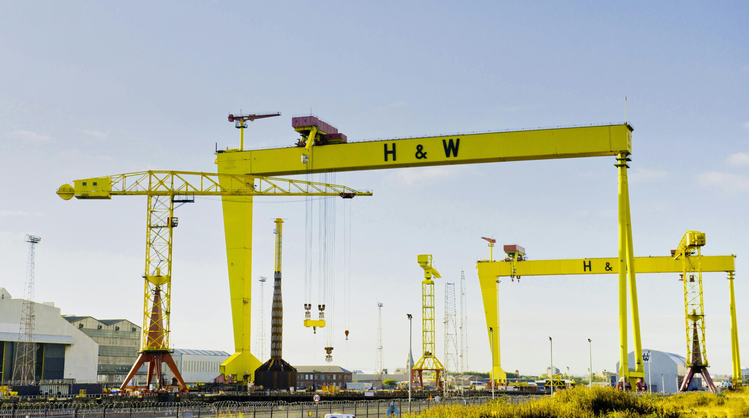
Cranes, hoists, and moving parts are often painted yellow or orange to enhance visibility.
4. Safety Zones and Aisles
Factories use floor markings:
- Yellow for caution areas.
- Green for safe walking paths.
- Red for fire-fighting equipment zones.
5. Storage and Waste Areas
Hazardous waste bins are colour-coded (as per Bio-Medical Waste Rules, 2016, and similar industrial waste standards).
💬 Real-World Example: Colour Saves Lives
A large manufacturing plant in Gujarat once experienced multiple near-miss incidents because workers confused compressed air lines with oxygen lines — both unmarked.
After implementing the IS 2379 colour code, confusion dropped to zero. Maintenance teams could easily identify pipelines even in poor lighting. That’s the real power of a simple colour code — it prevents accidents before they happen.
🧩 Integrating Colour Codes into Your Safety Program
Here’s how you can effectively implement colour coding in your organization:
- Audit Existing Colour Schemes
- Identify inconsistencies and outdated signage.
- Follow Relevant Indian Standards (IS 2379, IS 1234, IS 9457)
- Always align with BIS recommendations.
- Use Durable and Visible Paints / Signage Materials
- Especially for outdoor or high-temperature areas.
- Train Employees
- Conduct toolbox talks or safety induction sessions explaining colour meanings.
- Review Periodically
- Faded paint or damaged signs can lose their effectiveness.
- Involve Workers
- Encourage feedback; sometimes workers spot confusion points that management overlooks.
🌈 Colour Coding Beyond Safety – The Productivity Link
Interestingly, the right use of colour also boosts productivity and morale.
- Green reduces eye strain in control rooms.
- Blue promotes concentration in offices.
- Yellow improves focus in inspection areas.
- White enhances brightness in assembly shops.
By designing a workplace that’s both safe and visually balanced, companies can achieve higher performance levels with fewer accidents.
📋 Summary: The Language of Colours
Let’s recap the core messages of colour and safety:
| Colour | Meaning | Typical Use |
|---|---|---|
| Red | Danger / Fire | Fire alarms, stop switches |
| Yellow | Caution | Hazard zones, warning signs |
| Green | Safe condition | First aid, exits |
| Blue | Mandatory action | PPE requirements |
| Black & White | Information / Guidance | Markings, directions |
Colour coding transforms complex safety communication into a simple visual language that anyone can understand at a glance.
🏁 Final Thoughts
Safety isn’t just about rules — it’s about awareness. And colours are one of the simplest, most effective tools for building that awareness.
Every factory, plant, and office can enhance its safety culture by adopting proper colour codes and safety signs. They don’t just prevent accidents — they create a sense of order, discipline, and confidence among workers.
So next time you walk through your workplace, take a moment to notice the colours around you. Each one tells a story — a story of safety, awareness, and care.
Remember:
“Safety speaks in many languages — and one of the most powerful is colour.”
🔁 Readers also enjoyed these blog posts:
- Safety Management’s Role: The Unsung Hero Behind Every Successful Organization
- Safety Management and Its Responsibilities: Protecting People, Preventing Hazards, and Promoting a Culture of Care
- Benchmarking for Safety Performance: A Key to Continuous Improvement
“Start Your Website Journey Today – Exclusive Hostinger Discounts!”

Turn Any Idea into Viral,
Jaw-Dropping AI Videos in Seconds!