🌈 Introduction
Have you ever noticed how a warning sign pops out at you in bright yellow and black? Or why safety walkways are painted in bold colors instead of dull shades? That’s no coincidence — it’s science in action.
In the world of occupational safety and ergonomics, visual factors like luminance, contrast, and color contrast play a major role in how efficiently and safely people perform their tasks.
From factories and construction sites to control rooms and offices — good visual design reduces fatigue, prevents errors, and improves reaction times. In short, it can make the difference between a near miss and an accident.
In this detailed article, we’ll unpack what luminance and contrast mean, how they influence safety, and the best practices for designing workplaces that are bright, clear, and safe.
💡 What Is Luminance?
Let’s start with the basics.
Luminance refers to the amount of light emitted or reflected from a surface in a particular direction.
In simple terms, it’s how bright a surface appears to the human eye.
- It is measured in candelas per square meter (cd/m²).
- The higher the luminance, the brighter the surface appears.
Think of it like this:
- A freshly painted white wall in sunlight has high luminance.
- A dark concrete floor in shadow has low luminance.
Luminance determines how visible an object is against its background. In safety-critical environments — such as control panels, machinery areas, or traffic routes — proper luminance ensures that workers can identify signals, labels, and pathways without strain.
🌓 Understanding Contrast: The Key to Visibility
Contrast is the difference in luminance between two adjacent surfaces or objects. It’s what helps your eyes distinguish one thing from another.
There are two major types of contrast that matter in workplace safety:
- Luminance Contrast
- Colour Contrast
Let’s explore both in detail.
🔦 1. Luminance Contrast
Luminance contrast is the difference in brightness (luminance) between an object and its background.
It’s what makes black text readable on a white page — or yellow hazard markings stand out against a dark floor.
Mathematically, it can be expressed as:
[Contrast Ratio = \frac{L_{max} – L_{min}}{L_{max} + L_{min}}]
Where:
- ( L_{max} ) = luminance of the brighter area
- ( L_{min} ) = luminance of the darker area
The higher the ratio, the more visible the object becomes.
For example:
- White text on black background: High contrast → Easy to read.
- Gray text on slightly lighter gray background: Low contrast → Difficult to read.
✅ Why Luminance Contrast Matters in Safety:
- Ensures safety signs, warnings, and controls are clearly visible.
- Helps workers quickly identify hazards, even from a distance.
- Reduces eye strain and mistakes in reading instruments.
- Improves visibility in low-light or high-glare environments.
⚙️ Practical Examples:
- Machine control labels should have dark text on a light background (or vice versa).
- Stair edges should be highlighted with contrasting colors to prevent tripping.
- Walkways and hazard zones should be clearly marked with high-contrast paint.
🎨 2. Colour Contrast
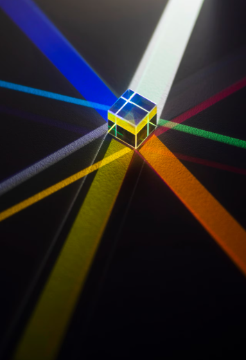
Colour contrast refers to the difference in hue and saturation between two colors.
While luminance contrast deals with brightness, colour contrast deals with distinctiveness — how easily one color stands apart from another.
For instance, red and green have a strong color difference, but for some people (like those with color vision deficiencies), this contrast might not be visible.
That’s why relying only on color contrast is risky in safety-critical designs. Both color and luminance should be considered together.
🧠 The Science Behind How Our Eyes Perceive Contrast
Human vision is designed to notice differences. Our eyes detect edges, boundaries, and brightness variations far more efficiently than absolute light levels.
This means that even if lighting levels are high, poor contrast can make things hard to see. Conversely, with proper contrast, visibility can remain excellent even in lower light.
However, too much contrast can also be a problem. For example:
- High-glare white surfaces can cause eye discomfort.
- Sharp contrast transitions can distract or disorient workers.
So, the goal is optimal contrast — not too little, not too much.
🏭 Luminance and Contrast in Industrial Workplaces
In industrial settings, workers often perform tasks that demand visual precision. From reading gauges to identifying color-coded wires, visual clarity is essential.
Let’s see how luminance and contrast influence safety and efficiency in these environments:
1. Safety Signage
- Signs should have high luminance contrast — e.g., black text on a yellow background.
- The combination must remain visible under varying lighting conditions.
2. Floor Markings and Walkways
- Floor boundaries, stairs, and emergency routes should be painted in contrasting colors (like yellow on black).
- This prevents trips and guides workers during emergencies or low-light situations.
3. Control Panels
- Switches and indicators must have clear visual separation.
- Important controls should be highlighted using both luminance and color contrast.
4. Equipment Identification
- Equipment parts requiring frequent inspection should be painted in contrasting tones to stand out.
💼 In Office Environments
You might think luminance and color contrast are only industrial concerns — but even in offices, they play a big role.
Common issues caused by poor contrast:
- Eye fatigue due to screen glare or bright white paper reflections.
- Difficulty reading text due to low contrast between fonts and backgrounds.
- Improper lighting leading to reflections on computer monitors.
Best practices:
- Maintain balanced illumination (300–500 lux).
- Use neutral wall colors to reduce glare.
- Ensure screen backgrounds have adequate contrast ratios (at least 4.5:1 for readability).
🧱 Designing with Contrast: Do’s and Don’ts
| Do’s | Don’ts |
|---|---|
| Use high-contrast colors for safety markings (e.g., yellow/black, red/white). | Avoid similar shades (e.g., red/orange) that blend visually. |
| Test signage visibility under real lighting conditions. | Don’t rely solely on design software color previews. |
| Ensure luminance levels are consistent across areas. | Don’t create abrupt light-dark transitions that disorient workers. |
| Consider color-blind users when choosing color codes. | Avoid color combinations like red-green or blue-purple for critical signs. |
🌈 Choosing Color Combinations for Maximum Safety
| Purpose | Color Scheme | Meaning / Example |
|---|---|---|
| Warning Signs | Yellow with Black | Caution, hazard, risk areas |
| Prohibition Signs | White with Red | No entry, stop, restricted area |
| Mandatory Signs | White with Blue | PPE requirements (e.g., “Wear Helmet”) |
| Emergency Signs | White with Green | Exit routes, first aid locations |
These combinations work because they offer strong luminance and color contrast, even in varied lighting.
🔍 Standards and Guidelines on Luminance & Contrast
Several international and national standards provide recommendations on visual ergonomics:
- ISO 9241-303: Guidelines on visual display requirements and contrast ratios.
- OSHA (Occupational Safety and Health Administration): Emphasizes visibility of safety signs and markings.
- BIS (Bureau of Indian Standards): Recommends appropriate illumination and color coding for industrial safety.
- Factories Act & Rules (India): Require adequate lighting and contrast for safe operations.
Recommended Luminance Ratios (According to ISO Standards):
- Task Area to Surroundings: 3:1
- Task Area to Background Walls: 10:1
Maintaining this balance prevents glare and visual fatigue.
🧩 How to Measure and Maintain Proper Luminance and Contrast
- Use a Lux Meter and Luminance Meter
- Measure brightness levels at various work points.
- Regular Lighting Audits
- Check if illumination is evenly distributed and within recommended limits.
- Clean Fixtures and Surfaces
- Dust or grime can significantly reduce luminance.
- Use Matte Finishes
- To reduce reflection and glare from shiny surfaces.
- LED Lighting
- Offers consistent brightness and can be adjusted to suit contrast needs.
👁️🗨️ Color Vision and Inclusivity
Approximately 8% of men and 0.5% of women experience some form of color blindness.
That means relying solely on color to convey critical safety information can leave some workers at risk.
Solutions:
- Combine color with shape or text cues (e.g., triangular yellow sign for warning).
- Ensure luminance contrast is high enough that visibility remains effective even for those with color vision deficiencies.
🌤️ The Role of Natural and Artificial Light
Contrast and luminance perception change drastically under different lighting conditions.
- Daylight: Offers dynamic range but can cause glare if uncontrolled.
- Artificial light: Provides stability but needs proper layout and color rendering.
Using a mix of both — with diffusers, blinds, and appropriate luminaire positioning — maintains visibility while minimizing eye strain.
🛠️ Practical Example: Improving Contrast in a Factory
Let’s say a manufacturing unit had frequent incidents of workers tripping on steps near a machine area.
Upon inspection, it was found that:
- Floor and step colors were almost identical.
- Lighting was uneven, creating dark shadows.
After applying high-contrast yellow paint to stair edges and improving luminance with LED overhead lights, incidents dropped dramatically.
This simple change turned out to be a cost-effective safety improvement — all thanks to better luminance and contrast management.
⚡ The Balance Between Aesthetics and Safety
In modern workplaces, designers often aim for clean, minimal aesthetics. But safety should never be compromised for visual appeal.
Good design = Beautiful + Safe.
Smart workplaces blend ergonomic lighting, balanced contrast, and color logic to create spaces that are both appealing and secure.
✅ Key Takeaways
- Luminance determines how bright a surface appears.
- Luminance contrast helps distinguish objects from their background.
- Colour contrast enhances visibility and recognition.
- Too little contrast = poor visibility. Too much contrast = glare and discomfort.
- Maintain proper illumination, clean fixtures, and use contrasting safety colors.
- Always consider workers with color vision deficiencies when designing visual safety cues.
✍️ Final Thoughts
Luminance and contrast may sound like technical lighting jargon, but in reality, they are cornerstones of safety and efficiency.
From preventing accidents to improving comfort and focus, they quietly shape how we see, react, and stay safe every day.
So next time you step into your workplace, take a closer look —
Are the signs clear? Are pathways visible? Are lights uniform?
Because sometimes, a little more contrast can save a lot more than just time — it can save lives.
Stay Safe. Stay Visible. Stay Bright. 🌟
🔁 Readers also enjoyed these blog posts:
- Safety Management’s Role: The Unsung Hero Behind Every Successful Organization
- Safety Management and Its Responsibilities: Protecting People, Preventing Hazards, and Promoting a Culture of Care
- Benchmarking for Safety Performance: A Key to Continuous Improvement
“Start Your Website Journey Today – Exclusive Hostinger Discounts!”

Turn Any Idea into Viral,
Jaw-Dropping AI Videos in Seconds!


